RV Tech · Connectivity
Two uplinks, and knowing which one is lying
Starlink queried straight from the dish, why one ping target is not proof of a cell link, and data usage shown as tank gauges.
Starlink, in detail
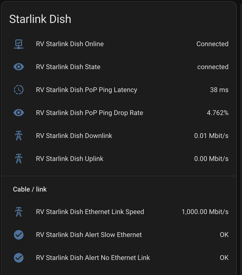
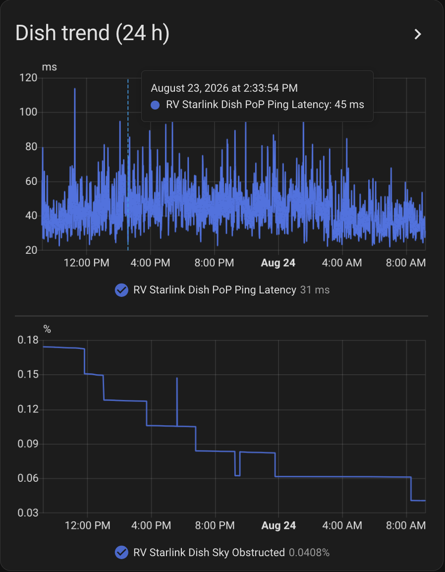
The dish is queried directly rather than through any app, so Home Assistant sees far more than "online": obstruction percentage, whether it is obstructed right now, outages in the last hour and the actual cause of each, the last reboot reason, thermal throttle and thermal shutdown warnings, ping latency and drop rate, and Ethernet link faults.
When service goes flaky, that is the difference between a tree, an overheating dish, and a Starlink-side outage — settled from inside the coach.
Do not judge a cell link by one ping target
Starlink is the metered plan; a cell hotspot is the unlimited one. The router scores both every 30 seconds and prefers the unlimited link to spare the metered one.
The lesson that cost the most time: do not let one ping target be the sole proof that a cellular link is alive. On this hotspot, ICMP is deprioritized enough to produce false failures — the router concluded the link was dead, failed over to satellite, and flapped back and forth all day, burning the exact plan it was trying to protect. The honest test is an application-level probe, or several samples against more than one target.
Which link actually won is readable from the driver's seat — see the [ON] tag in the tank gauges below.
Data usage as fuel gauges
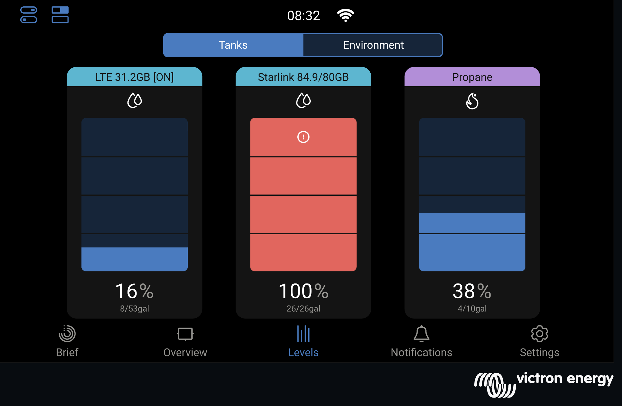
The Cerbo lets you define "virtual tanks." They are meant for holding tanks. Both of ours are spent on Starlink and cellular data usage instead, so the screen in the coach shows the month's data burn as two tank gauges sitting right next to propane.
It is the same glance-and-go read as any other tank, and it changed our behaviour more than any dashboard ever did.
There is a second trick hiding in the label. A tank's name is just a text field, so it can carry what a level gauge cannot: whichever link is currently carrying traffic gets [ON] appended to its name. The router re-picks the active uplink every 30 seconds and the label follows it. So the screen answers two questions at once — how much have I used, and which one am I on right now — without a single extra widget.